In Part 8, we’re going to talk about scene intersection shaders. What are those? Well, sometimes, you want the appearance of your object to change when it physically intersects another object. In fact, here’s three examples of that: the first is adding some ambient occlusion around the edges of an object, the second is making the edges of the object glow, and the third is adding foam to the parts of a water mesh that intersect the coast and other objects in the water.
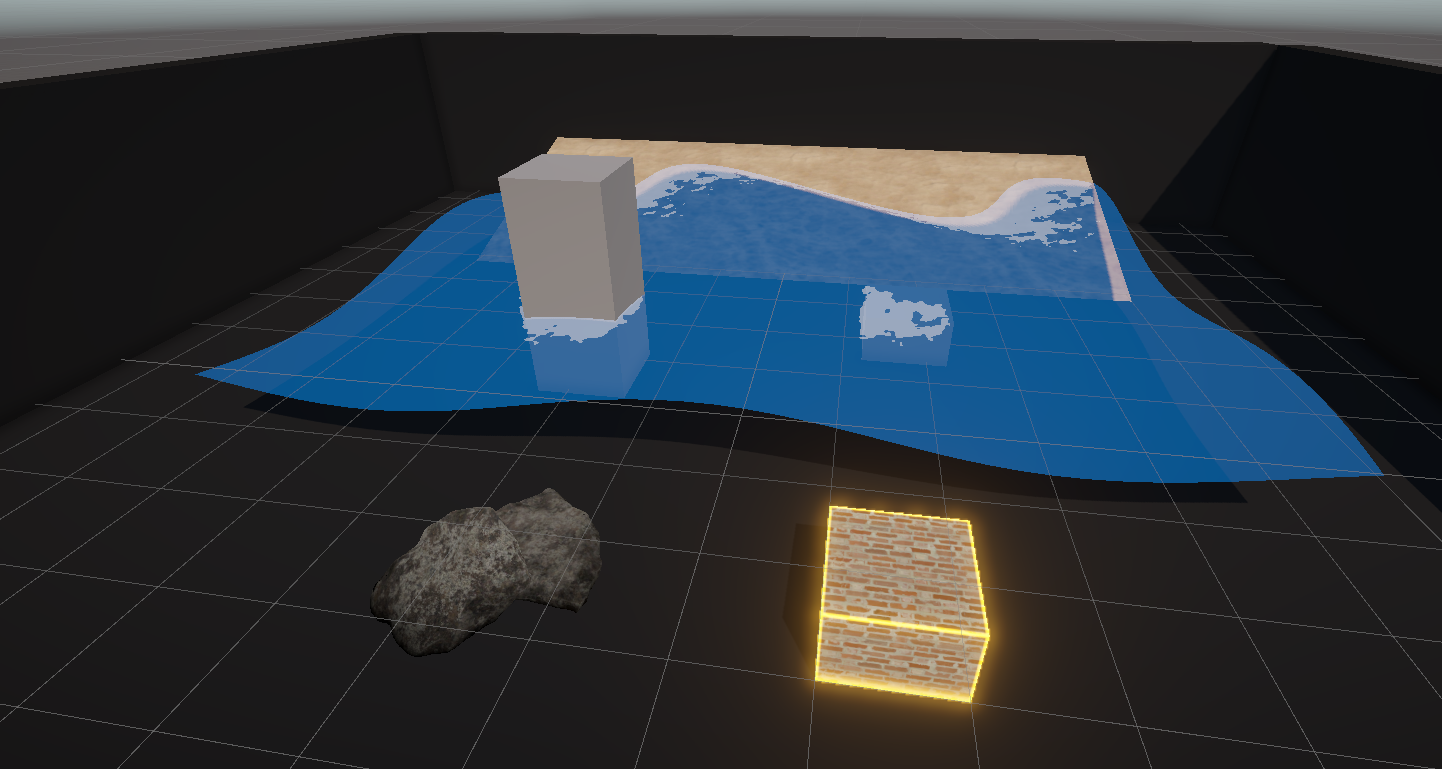
In this tutorial, we’re going to cover the occlusion effect, and in the next Part, we’ll cover the other two. I also published my first-ever Patreon-exclusive video which provides a much deeper overview of the graphics pipeline! It acts as a companion piece to this tutorial for those who want to delve deeper.
We talked about ambient occlusion in Part 6, and to recap, it’s the phenomenon where light can’t reach crevices on an object’s surface, so in Lit shaders, we can use a texture to make those bits darker. Ambient occlusion also appears in real life when you have two objects placed close to each other - you’ll see shadows around the intersection. See the underside of this goose.

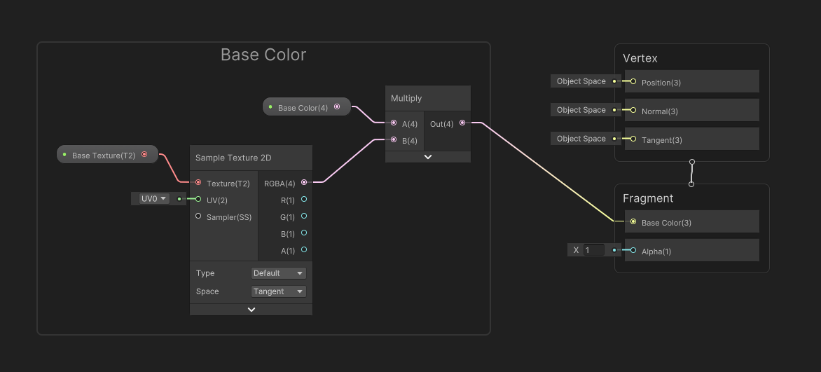
That’s what I’m going to recreate with this shader, and here’s a super simple test scene with a plane and a sphere mesh which will use this shader. We can manually simulate occlusion in an Unlit shader, kinda like how we explored custom lighting in Part 7, so I’m going to create an Unlit shader for simplicity via Create -> Shader Graph -> URP -> Unlit Shader Graph, and name it “IntersectionOcclusion”. As with a lot of these graphs, I’ll start off with Base Color and Base Texture properties wired up like this, then we can work on adding the occlusion.
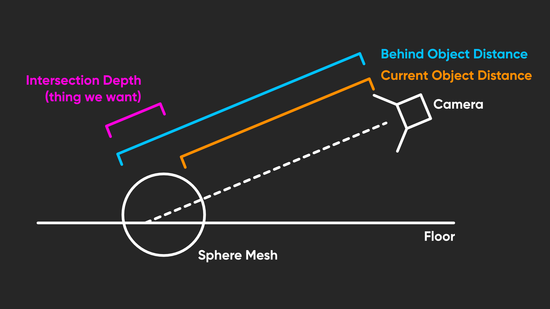
But first, let’s break down how we’re going to detect the intersections. When a shader is running, it only has direct access to information about the pixel currently being rendered, including its position. We want to compare that position to the position of the next object rendered behind it, and if the distance between the two points is smaller than a threshold we specify, then we have detected an intersection. The only way we’re gonna get information about the other object is indirectly through the depth buffer, which we covered in Part 4. It’s possible to use depth values to reconstruct the position of the object, which is what we’re gonna do.
That does immediately throw a couple of limitations into the mix. First, our intersection shader must be transparent, because Unity only saves the state of the depth buffer into the depth texture after rendering all opaques and before rendering all transparents. Second, our shader will not be able to detect intersections between any two transparent objects, for that same reason.
Let’s jump into Shader Graph and try a couple of things out, then. When I went into making this tutorial, I was so excited to try out the new Scene Depth Difference node which is meant to make all of this easy. But I’m gonna level with you - I have no idea what the heck this node is doing. Look what you get when you set the node to Eye mode - I can’t even conceive what Eldritch horrors are going on behind the scenes here. The other modes require a lot of additional nodes to get working, too. So instead, we’re gonna use the old-fashioned method.
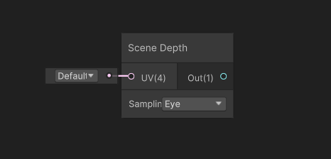
First, we’ll use a Scene Depth node to get the distance between the camera and whatever object was previously rendered at this pixel. If you recall from Part 4, which was all about the depth buffer, we can use Eye mode to get precisely this distance.
Then, we need to get the distance between the camera and the object we are currently rendering. Explaining how to get that value is a little technical, but I’m going to give you a full rundown for the sake of clarity and completeness, so bear with me. You don’t need to understand every detail here, but I don’t want to just pull a bunch of nodes from thin air! So, here we go.
In Part 5, I talked about how the graphics pipeline turns abstract mesh data into stuff on your screen. Well, near the end of the pipeline, the vertices of your mesh are defined in clip space, which is a representation of your mesh relative to the camera, including its near and far clip planes and its field-of-view. Everything is either inside or outside the camera’s visible bounding box.
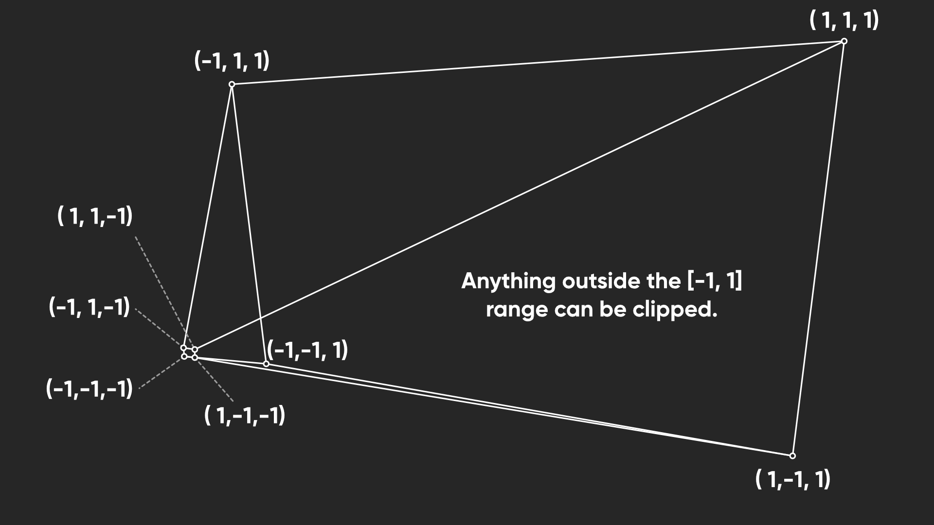
Clip space, as the name suggests, makes it easy for Unity to clip (or in other words, remove) objects that won’t be visible, since they’re outside the box. Unity then gets from clip space to screen space by accounting for the camera’s perspective, which happens automatically after the vertex stage, even if you’re writing a code-based shader. That’s the bit I didn’t mention in Part 5.
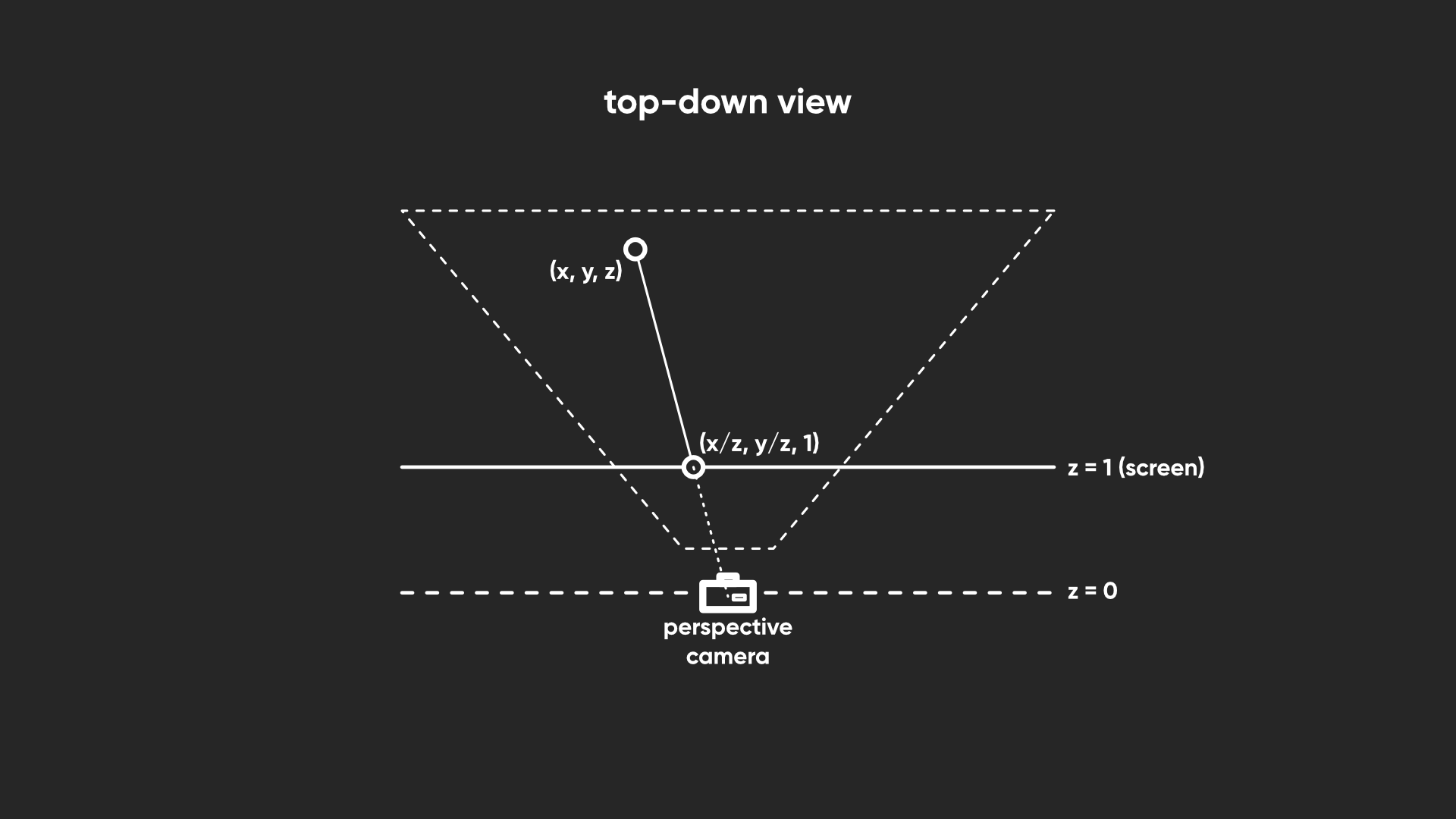
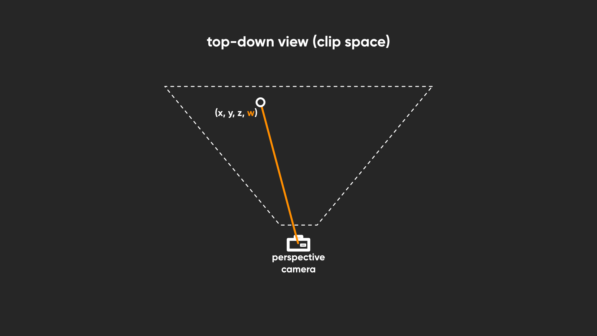
The key thing about clip space is that it uses a 4D vector to represent your 3D vertex positions, and I’ll leave a quick explainer at the end of this article and a bonus little Patreon video to explain why that’s the case because that is getting far too into the weeds for this tutorial, but the useful thing for us is that the fourth component of that vector is equal to the distance between the camera and the vertex being rendered. Hey, that’s just what we wanted!
Subscribe to my Patreon for perks including early access, your name in the credits of my videos, and bonus access to several premium shader packs!
In Shader Graph, we can access this value using a Screen Position node with its Mode set to Raw. Despite the name of the node, Raw mode gets us the clip space positions rather than screen space positions. We can grab the fourth component of the vector using a Split node. So here we have the two distances we need, and we can get the difference between them by subtracting one from the other.
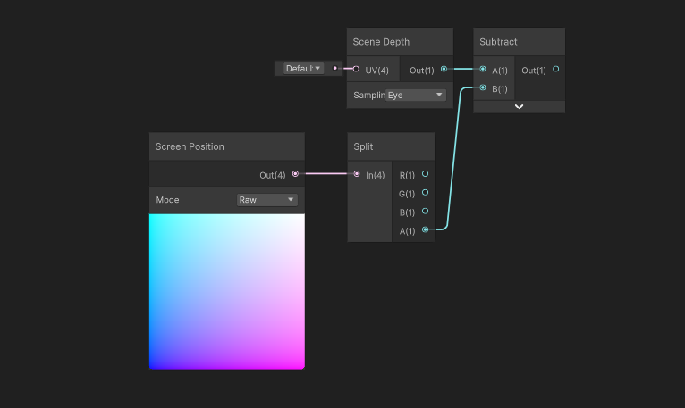
Now, this is all great, but this is a collection of nodes that I think I will need to use more than once. We can, of course, just copy and paste these nodes into other shaders as and when we need them, but there’s a more elegant way of reusing nodes by using subgraphs. A subgraph is like a function that we can insert into full graphs to act like a single node. To create a subgraph, let’s left click and drag around these four nodes, right-click, then choose Convert To -> Subgraph. We can save it wherever we want - I’m going to call it “DepthIntersection”, and then we can double-click the new subgraph in the Project View to open it in a new Shader Graph editor window.
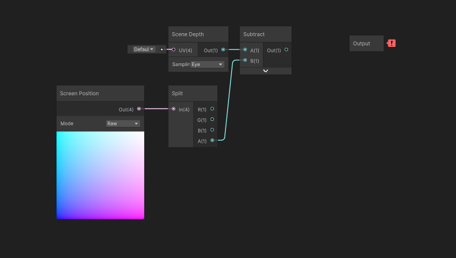
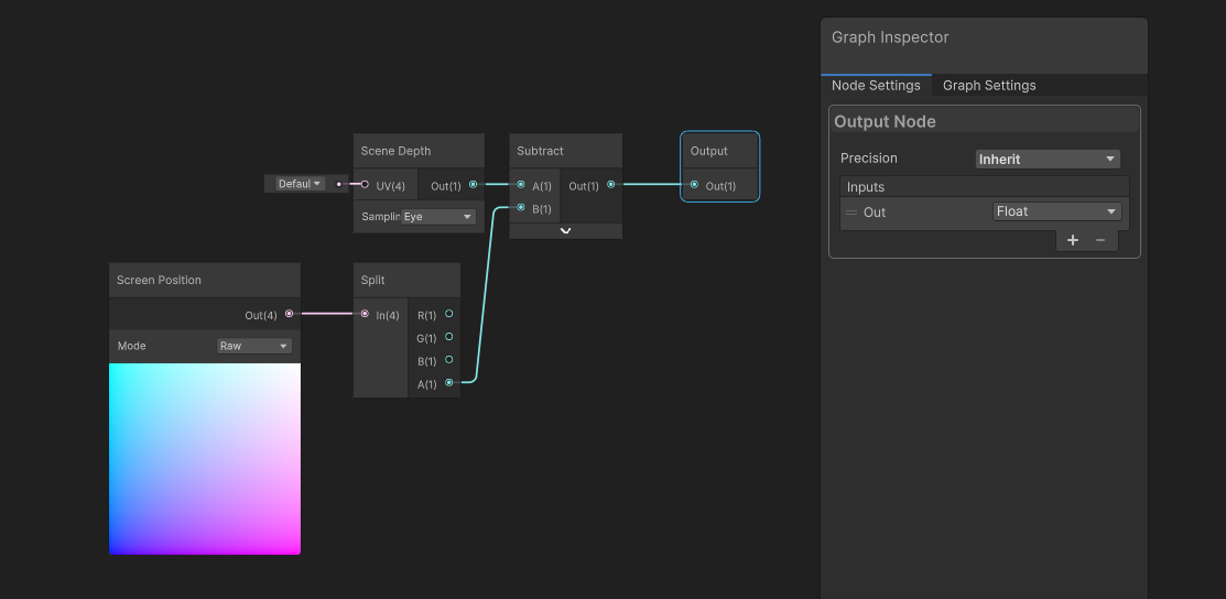
With a subgraph, we need to define the inputs and outputs however we want. This particular subgraph doesn’t need inputs, but we could add those the same way we add properties to a regular graph by using the plus button. For the outputs, we can click the Output node that should be somewhere on the subgraph and go over to the Node Settings. Here, we can add new outputs to the list using the plus arrow. The only output from this subgraph will be the distance value representing the intersection length, so I’ll add a Float output, which I can rename by double-clicking the name field. Following the convention of most of Unity’s built-in nodes, I’ll just name it Out. Finally, we can connect the Subtract node to the Output node. Let’s hit Save Asset and return to our main IntersectionOcclusion graph.
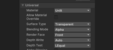
We now have a way of detecting intersections, although as I mentioned, this will only work in Transparent graphs, so let’s go to the Graph Settings and make sure the Surface is set to Transparent. If we output the intersection values to Base Color, the sphere mesh would look like this, with black around the edges and white when there is no intersection.
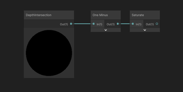
Instead, I want to turn this into a value where 1 represents intersections at their full strength and it gets lower as we get further from an intersection, so we’re going to use a One Minus node for that, but now some of the values away from the intersection are going to be negative which will mess with the next steps of the calculation. So next, we’ll use a Saturate node, which sets negative values to become zero and values above 1 to become 1. I’m not a fan of the name, but it’s a holdover from shading languages like HLSL and a good analogy for how it works is to think of a box with a capacity of 1; it can’t be emptier than having nothing in it, and you can’t overfill it, so trying to add like 1.5 means the .5 is just lost.
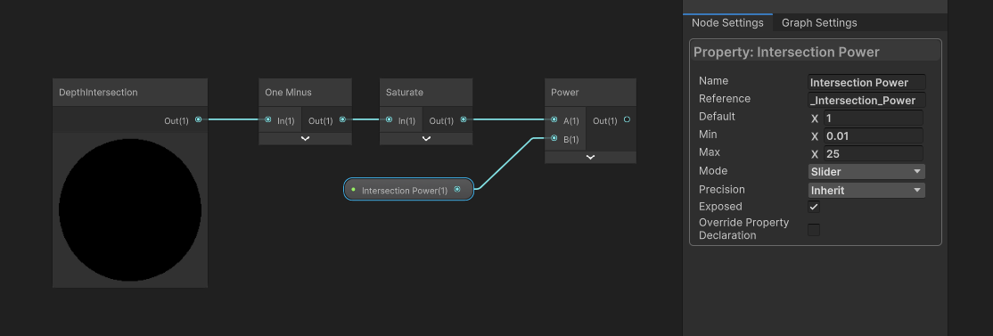
Next, let’s think about how to control the width of the intersections. There are lots of ways to do this, but we’re currently working with values between 0 and 1, so the easiest way is probably to just raise the values to a configurable power value. Let’s add a Float property called Intersection Power, which I’m going to make a Slider between 0.01 and 25, because a value of 0 would apply full occlusion to the entire mesh, and 25 is an arbitrary value that results in very thin occlusion. We’ll use a Power node with the Intersection Power property, which now means the thickness of the occluded portion of the mesh can be configured.
Now let’s add the ability to make the occlusion lighter or darker overall by adding another Float property called Occlusion Strength. This one can be a slider between 0 and 1. It’s going to act as a global multiplier for the values we’ve calculated so far, so go ahead and drag the property onto the graph and multiply it with what we have so far.

So far, we still have a value between 0 and 1, where 0 represents areas where we have no occlusion and 1 represents full occlusion (although due to the Occlusion Strength property, the maximum value might actually be below 1). To apply this to the base color, let’s use a Lerp node. In the T slot, we can plug in the value we just calculated. In the A slot, where there is no occlusion, let’s plug in the Base Color nodes I added right at the beginning. And in the B slot, where there is full occlusion, let’s add a Float node and set a value of 0, which means totally black. Finally, we can output the result to the graph’s Base Color output.
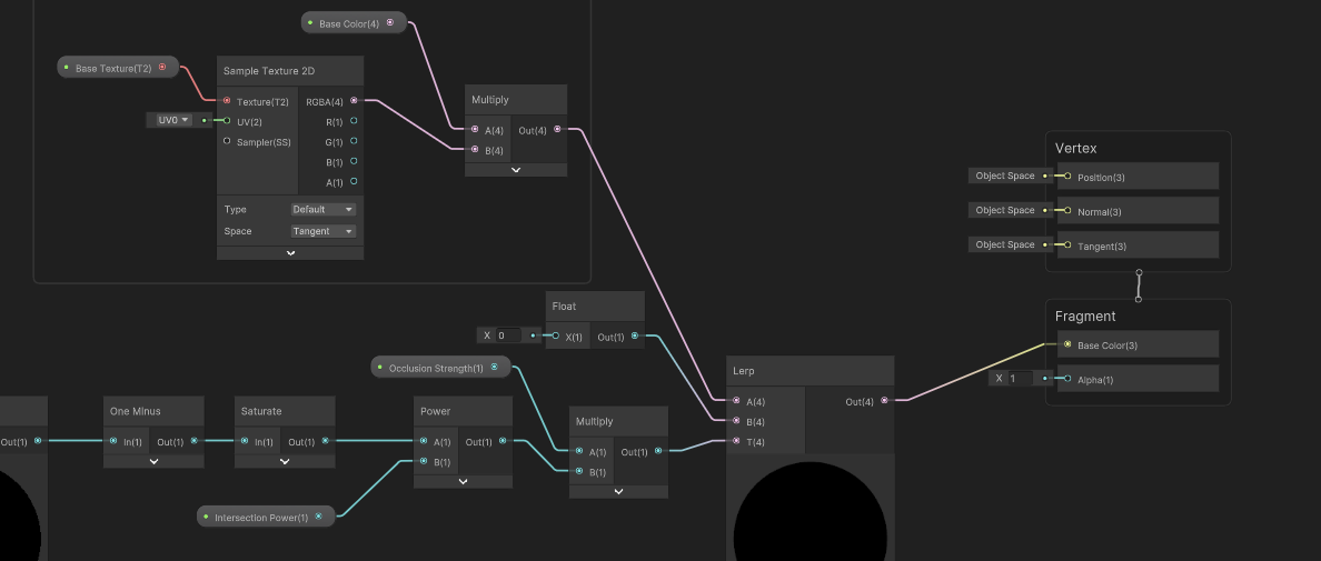
In the Scene View, we can play around with the Intersection Power to make the occluded sections of the object thicker or thinner, and change the Occlusion Strength to modify the overall strength of the occlusion effect.

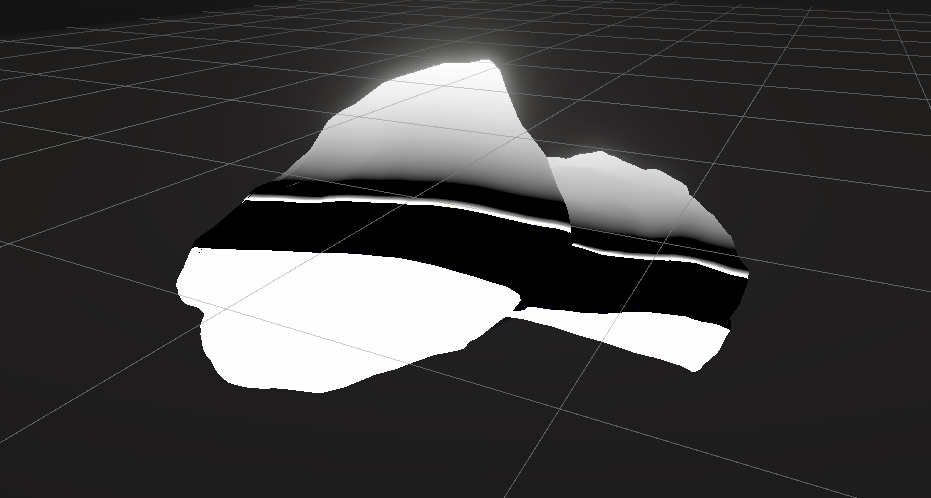
Note that this shader will run into problems in some scenarios, such as if you add a cube that’s flush with the surface of the floor but only juts out a tiny bit. When viewed from above, the intersection distance for all the pixels is very low, so it’s going to apply occlusion to everything and make the whole object darker.

I found that the effect works really well with objects like rocks, where it’s pretty common to just add the mesh clipping through the floor and then we can rely on occlusion to soften the boundary between the rocks and the floor.
What we’ve just implemented is a very basic version of screen-space ambient occlusion. More elegant solutions use depth values from several pixels around the pixel being rendered in order to get a more accurate understanding of the shape of the objects around the pixel, but I wanted to show you the most basic version - if you’re interested in going deeper, look into other SSAO techniques. That said, SSAO is usually implemented as a post processing effect, so it might be a bit more complicated to create your own version, at least in URP.
This Part is getting pretty long, but I still want to show you the other two effects from the start of the tutorial, namely the edge glow and water foam shaders, so the next article in this series will cover those two effects. Until next time, have fun making shaders!
A Quick Explainer About Homogeneous Coordinates
Under the hood, the graphics pipeline uses 4D vectors to represent 3D points in space. This representation is called “homogeneous coordinates” or “perspective coordinates”, and we use them because it is impossible to represent a 3D translation (i.e., moving a point in space) using a 3x3 matrix. Since we want to efficiently package as many transformations as possible into a single matrix (which you can do by multiplying individual rotation matrices, scaling matrices, and any other transformation matrices together), we take our 3D point vector in Cartesian space (what you probably normally think of when you are using a coordinate system) and bolt an additional “w” component equal to 1 onto the end of the vector. This is a homogeneous coordinate. Thankfully, it is possible to represent translations using a 4x4 matrix, so we use those instead. Adding a component to the vector was necessary because you can’t apply a 4x4 matrix transformation to a 3D vector.
In homogeneous coordinates, any vector that is a scalar multiple of another vector are in fact representative of the same point - the homogeneous points (1,2,3,1) and (2,4,6,2) both represent the Cartesian 3D point (1,2,3). So, now by the time we get to just before the view-to-clip space transformation, the w component of each point is still 1 since none of the preceding transformations alter the w. After the view-to-clip space transformation, the w component of each point is set to be equal to the view-space z component.
In essence, this means the clip space w is equal to the distance between the camera and the vertex of the object being rendered. That’s what I needed in this tutorial.
And, for funsies and completeness, after this, the graphics pipeline executes the “perspective divide”, whereby your 4D vector is divided by its own w component in order to collapse every point on screen onto a virtual ‘plane’ located at z=1. This is where things get shown on screen. Basically, two points with identical (x,y) clip space values do not necessarily get placed at the same (x,y) screen positions, as they may have different clip space z values - with a perspective camera, further away objects appear smaller. After the perspective divide, all your points are in the form (x,y,z,1) so you can drop the z and w components and bam, there’s your 2D screen positions. It’s fascinating to me that we need to deal with 3D, 4D, and 2D just to get stuff on your screen.
I go into even more detail about the entire graphics pipeline in my first-ever Patreon-exclusive video! I’m really happy with how that video turned out, so if you want to learn more, please check it out!
