This article is based on a video I did where I gave a broad overview of 10 varied shaders. The ‘10 minutes’ concept doesn’t translate to text perfectly, but I’ll still cover each of the shaders as quickly as possible!
Inverted Hull Outlines
Outlines are much harder to do than you’d initially expect, and many of the best techniques require post processing and lots of in-depth considerations and performance trade-offs to get the effect looking just right. The inverted hull method, on the other hand, can give you results that work alright on rounded objects, although not so much on flat surfaces. We take the vertex position of the object and add an offset along the vertex normal in object space.

In the fragment stage, we can just use a block color for everything. To invert the hull, which mean only rendering the back faces of the mesh (as opposed to regular rendering which uses front faces), Shader Graph requires us to tick Two Sided which renders both sides of each face, then we make the front faces invisible by ticking Alpha Clip and using an Is Front Face node inside a Branch to clip away those front faces.

That leaves us with a material we can attach to any object’s second material slot to see the outlines come to life.

Dissolve
Dissolve in one of those effects that showed up a lot when Shader Graph was first released, because it’s a great showcase of its capabilities. With this effect, parts of an object fade out of existence from one end to the other, typically with a glowing edge.
We can wire up a base color and texture to form the regular look of the object before it starts to dissolve, then tick Alpha Clip in the Graph Settings, which we will use to cut away the object.

We generate a Perlin noise pattern using the Simple Noise node and add that to the object’s position, then use a Step node to cull pixels based on that value along one axis (in this case, the y-axis). If we use a Threshold property for this and change its value, we see the object fade in and out.

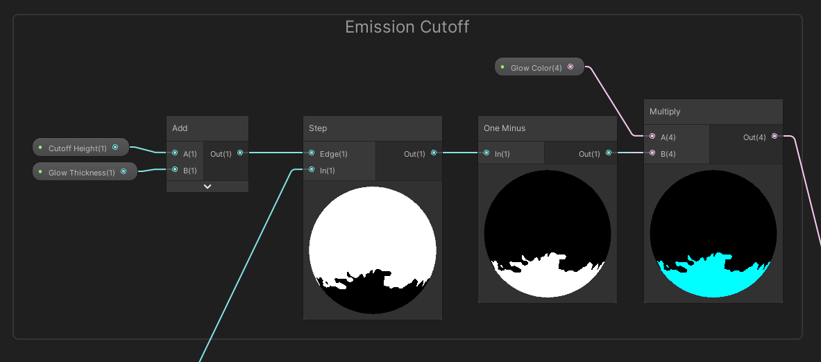
To add the glow, we can use a similar step threshold with a higher value, invert it with One Minus, then multiply by an HDR-enabled color and connect it to the Emission output.

We’re left with an object with one side being cut away and not rendered, with an uneven edge due to the inclusion of noise.

Dithered Transparency
This was the subject of my first tutorial video on YouTube! Rendering transparent objects is a little more expensive than rendering opaques, so it would be useful to find a technique that appears transparent but is actually opaque. Since opaque objects usually write depth information, we can cull anything behind the ‘fake transparent’ objects and avoid overdraw (a phenomenon which is common with alpha-blended transparent rendering). It won’t double your framerate but any performance gains are welcome!
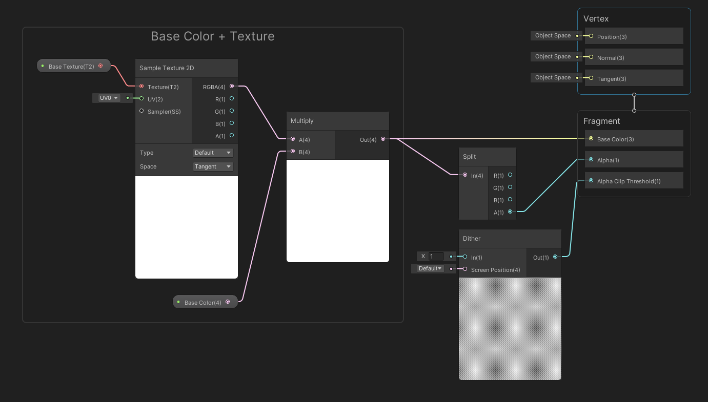
This effect uses Alpha Clip like the previous two. Leave the surface type as Opaque and wire up a base color and texture as usual. This time, Split the result and wire the alpha component to the graph’s Alpha output. Then, we’ll use a Dither node which generates a repeating 4x4 pattern of greyscale values in screen space and use it as the graph’s Alpha Clip Threshold output.

Behind the scenes, Unity culls any pixel whose Alpha value is below the corresponding Alpha Clip Threshold value. Lowering the base color alpha of the object fades out the object, despite every remaining pixel of the object being fully opaque.

Silhouette
Many objects write depth information to the depth buffer, which is used by Unity behind the scenes to ensure the nearest object to the camera gets rendered over objects behind it. Once every opaque object has been rendered, this information is made available to our shaders via the camera depth texture. As long as we use a transparent shader, we can access the depth information.
In URP, you have to find your URP Renderer asset and tick the Depth Texture box to enable it. Then in Shader Graph, we can access it with the Scene Depth node. If we use Linear01 mode, then the output is the depth where 0 is the closest possible distance from the camera and 1 is the furthest possible distance. If we use that in a Lerp node to pick between foreground and background colors, then output to Base Color, we can visualize the depth of any opaque object behind the one using this shader.

Just remember that transparent objects don’t show up in the depth texture!

Scene Intersections
Many games add some sort of effect to parts of objects that intersect other objects in the scene. For example, a glowing energy shield or foamy water could make use of a technique to find intersections.
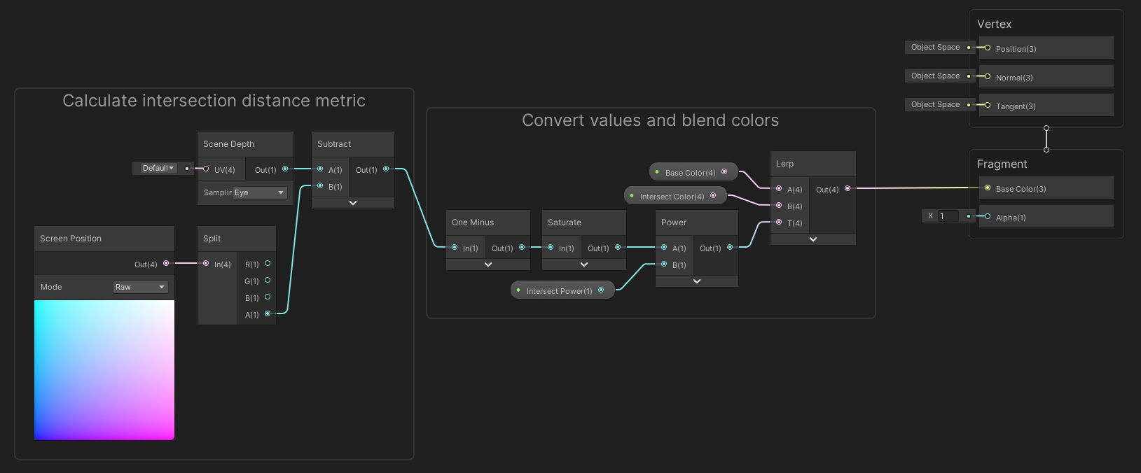
We’ll be using depth information again, so make sure Depth Texture is still ticked in your URP Renderer. Get the depth using a Scene Depth node, but this time, use Eye mode, which gives us the distance of a previously-rendered opaque pixel from the camera. Then, we’ll compare that to the position of the pixel currently being rendered, which we get from a Screen Position node in Raw mode, taking the fourth component with a Split node. The result is a value that gets higher the further you are from an intersection, so we can One Minus and Saturate the result.

This lets you visualize the distance around intersections, although it doesn’t find intersections when the camera is angled flush with the opaque surface being intersected.

Dot Matrix
With this effect, we take the screen position of each pixel and render only a select few of them along a grid pattern. Each pixel uses an emissive color so it looks like the whole shape glows, and we can configure the width of the gaps and the size of the dots.
Enable Alpha Clip in the Graph Settings, then wire up a base color and texture like usual. I’ll use a handful of nodes to work out which pixels are dots and which ones are gaps based on their screen position, and multiply these values by the texture alpha for the graph’s Alpha output. Due to the Alpha Clip Threshold, pixels with alpha below 0.5 get culled. Then, I output to both Base Color and Emission to achieve that sweet glowing effect.

You need to use a Bloom post processing effect set up to have the glowing, but the URP default scene handles that for you.

Stat Increases
When playing games like Pokémon, some moves increase or decrease your stats and you get a rising orange or falling blue effect overlaid onto the sprite.
Shader Graph supports shaders for 2D objects through the Sprite Lit and Sprite Unlit material types. For this effect, which uses Sprite Unlit, I calculate UVs in what I call ‘pixel space’ and scroll them over time in the y-direction. It’s a lot of nodes, but they are just for scrolling, and I control the direction of the effect by inverting the UVs if necessary.
![]()
Using the scrolling UVs, I generate a triangle wave and tile it in the y-direction, which involves a lot of remapping and modulo and adding, and generally a lot of nodes that would have been a couple of lines in shader code. I use the resulting values to Lerp between two colors and add them to the original sprite color.
![]()
The result is a colorful overlay on the original sprite.
![]()
Portal Vortex
Some games feature stylized portals like the ones in the Warp Room in Crash Bandicoot 2. The nostalgia is pretty strong!

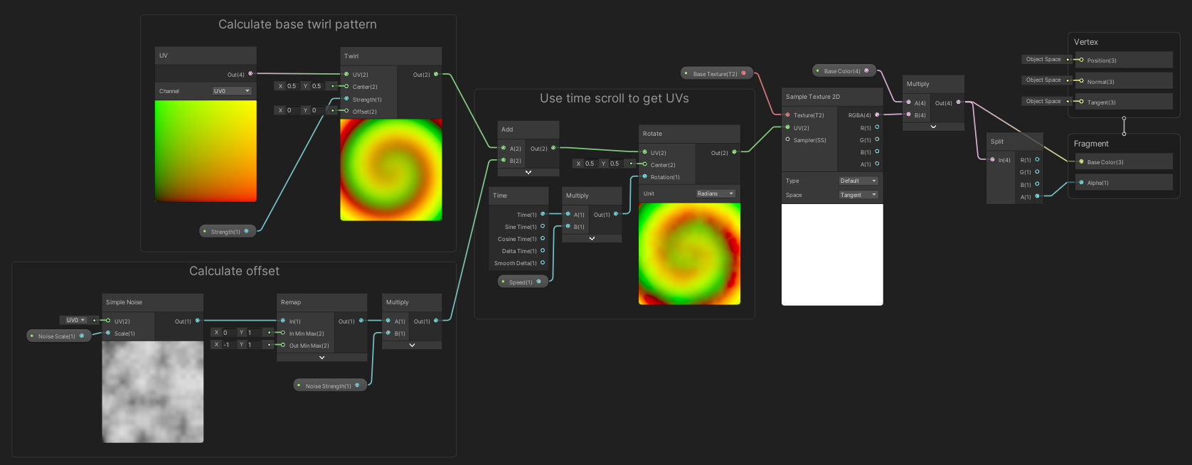
This is a Transparent effect, so tweak the Graph Settings accordingly. I’ll first use a Twirl node to twist the UVs into a swirling pattern, then add a slight noise offset in case you want variation in the pattern. Using those UVs, Rotate them around the center over time for some animation, then use those UVs to sample whatever texture you want.

This graph makes good use of the lesser-known nodes in Shader Graph.

CRT TV
Each pixel of your screen is made of sub-pixels that give off pure red, green, and blue light respectively, and the color of the pixel is controlled by varying the strength of these sub-pixels. On old CRT screens, the sub-pixels could be seen relatively easily, especially if you sat too close to the screen like I did when I was a kid. Somehow, I don’t need glasses - it’s a modern-day miracle.
For this effect, we’ll use a base color and texture as usual. Then, we’ll divide the screen into tiny 4x4 squares and use a secondary texture to assign red, green, blue, and black to each part of the square. I’m using black to represent the gaps between pixels. We’ll multiply the existing texture sample by these values, so now, each pixel on your screen is filtered to produce pure red, green, or blue light of varying strength (with black gaps in between), with a Brightness property to adjust the values for a secondary Emission output.
![]()

There are better ways to handle brightness than a simple multiplier, but it’s good enough for now! This kind of effect is best viewed at the native resolution.

Vertex Waves
We can create a convincing water wave effect using a vertex shader. With this effect, we’ll use a noise pattern and add a small offset along the y-axis to the vertices of the water mesh over time so it looks like there are waves rolling across the water’s surface.
Use the XZ position in world space and add an offset over time to use as the seed for a Simple Noise node. Since we’re using world space, we can tile the water meshes and the offset will be the same at the connection points between the tiling meshes. I’ll remap the videos so we can configure the size of the waves, then add it to the y-component of the vertex position, this time in object space. The XZ position of the waves should remain the same as they were. We’ll output the three components as a single Vector3 to the Vertex Position output.

We can just use a standard base color and texture for the Base Color output, and putting a plane in the scene will demonstrate how it bobs up and down.

Subscribe to my Patreon for perks including early access, your name in the credits of my videos, and bonus access to several premium shader packs!
