If futuristic games have one rule, it’s that you need holographic, glowing stuff with hexagons all over your game. That’s the aesthetic chosen by many developers for things like shields, and in this article, I’ll show you how to create this kind of shield in Shader Graph. I’m using URP, but it’ll work in HDRP or the built-in pipeline too. Did you know that Shader Graph works in built-in now? The more you know! All of the assets are on GitHub, complete with a bonus VFX effect when you hit the shield.
This tutorial uses Unity 2021.3.0f1 (LTS) and URP 12.1.6, although it’s probably suitable for previous or subsequent versions. Check out this tutorial over on YouTube too!
Breakdown
Let’s start with an overview of everything I wanted to accomplish with this shader. The effect is modular, and I used keywords to control which parts of the effect are active; if you want the shader to be less expensive, or if you just don’t like part of the effect, you can switch them off at any point.
Unity has a limit on the number of keywords you can include in a shader. Shader Graph will warn you at the top of the properties list if you exceed the limit. You can increase the limit via Preferences -> Shader Graph.
Here’s a screenshot of the completed effect:
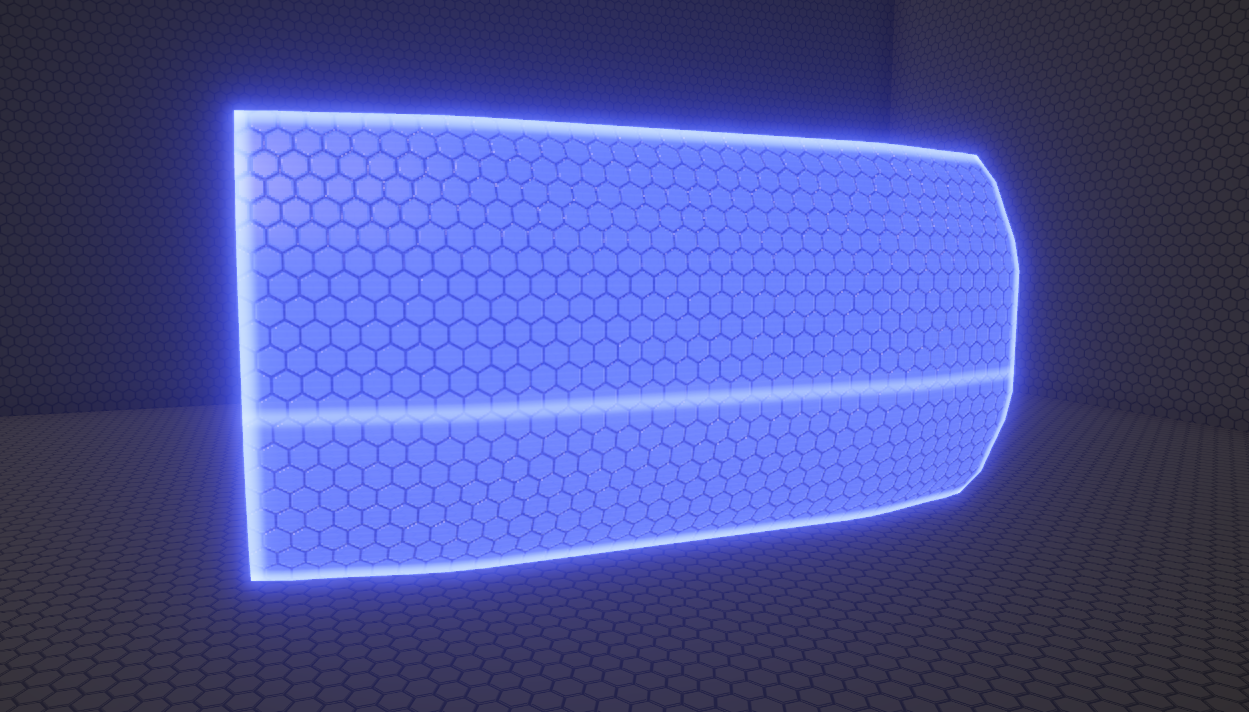
I separated the effect into about nine smaller parts, which I’ll tackle one at a time:
-
PBR FeaturesThe shield supports a base color output, plus smoothness and metallic. This isn’t the most interesting part of the shader, but PBR (Physically Based Rendering) properties are still important! -
Edge GlowThe edges of the shield mesh have a prominent glow, which helps to contrast the mesh with other environmental details. -
Intersection GlowWhen the shield moves through other objects, the intersecting parts of the shield glow just like the edges do. This effect helps the shield feel as if it is a physical entity in the world. You’d probably expect objects to light up when a hologram passes through it! -
Collision RipplesThe GitHub project contains a script which lets you ‘shoot’ the shield mesh. When you do, a bright ripple emanates from the center to provide some interactivity. Aside from the shader, the mesh also shakes and a VFX effect is fired (I won’t cover the scripting or VFX in this article). -
Glowing SurfaceAlthough you can’t see it in a static image, the surface of the shield has a faint glow. It pulses in and out of brightness, making it feel like an unsteady amount of energy is being used to power the shield. -
Hexagon TextureNo sci-fi object is complete without an array of hexagons, so I added hexagons. There is far less glow in the spaces between the hexagons. Think of the hexagons as giant pixels on a screen! -
Hexagon HeightmapThe hexagon texture is also used as a heightmap - the hexagons protrude slightly away from the surface, making it appear a bit 3D. -
Big ScanlineOne big glowing scanline sweeps the shield from top to bottom repeatedly. This provides a lot of movement and energy to the effect. -
Smaller ScanlinesWhen you get closer, you’ll start to notice smaller scanlines that are far less prominent. Great for up-close interactions with the shield.
Now that we have a good grasp on which features the shield will have, let’s implement them in Shader Graph one by one.
Setup
First, head to the Graph Settings and make sure you’re using a Lit shader with a Transparent surface. You’ll probably also want to turn on rendering Both sides if you’ll be able to view the shield from both sides, but that depends on how the shield operates in your game world. The other default settings are probably fine, but here are the settings I used in case the defaults ever change:
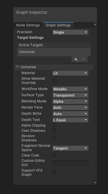
Each part of the effect requires shader properties, which I’ve neatly segmented into categories. As a result, any material using this shader will separate properties into collapsible sections - that’s handy!
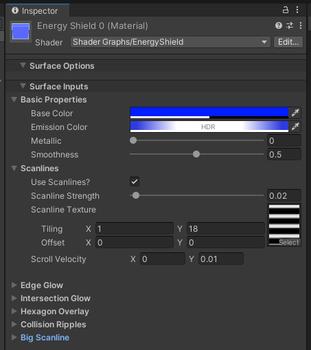
Now we can start adding nodes to the graph surface.
Basic PBR Features
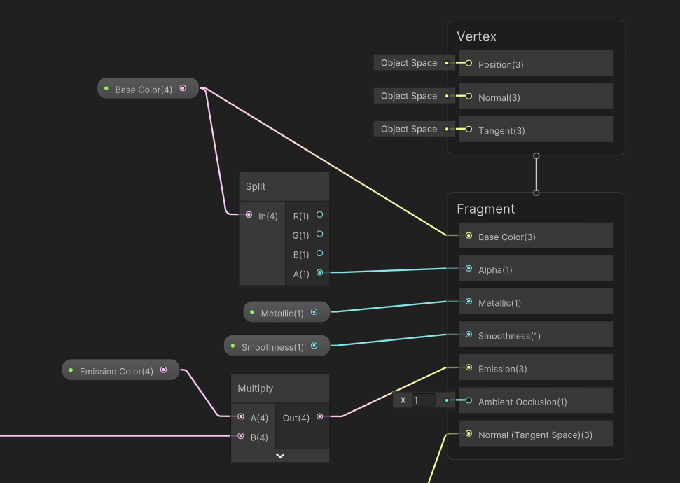
Lit shaders are designed to interact with Unity’s lighting (it’s in the name), so we need to establish some basic PBR functionality. The output stack has several PBR-related output blocks such as Base Color, Alpha, Metallic, and Smoothness, which we can model using simple properties. Correspondingly, I added a Color property called Base Color and Float properties called Metallic and Smoothness (which are bound between 0 and 1). The Base Color also provides the Alpha (transparency) output in its alpha component. Most of the shader will operate on the Emission output of the shader, which is controlled by another Color property called Emissive Color; I’ll come back to this part of the graph towards the end.
Edge Glow
Next up are the glowing edges of the shield. This marks the beginning of using keywords to control the shader’s features. Each one is a Boolean keyword which uses the Shader Feature setting; this makes the most sense, as we are using the keyword to toggle shader functionality wholesale. The scope should be set to Local so that features can be turned off on individual materials, rather than Global, which operates on all materials using the shader at the same time.

The first such keyword is called Use Edge Glow. Additionally, I added a Float property called Edge Glow Strength which should be between 0 and 1, and a Vector2 called Edge Glow Thickness which controls the proportion of the UV space taken up by the glow in the x- and y-directions. By that, I mean a value of (0.2, 0.1) would take up 20% of the total width on the left-hand side and 20% on the right-hand side, plus 10% on the top and 10% on the bottom. I could have used a singular Float rather than a Vector2, but here’s why I didn’t.
The shape of the shield mesh is rectangular - it’s twice as wide as it is tall, but I still use the full UV space, so a texture applied to the model without any texture scaling would look stretched.

We’ll worry about texturing later, but I’m mentioning the UV setup now because I’m using the UV coordinates to determine where the edges of the shield are. I use separate x- and y-values for the Edge Glow Thickness, because the y-value needs to be higher than the x-value to result in the same on-screen thickness. It’s kind of like I’m manually squashing to counteract the stretching.
Back in Shader Graph land, I’ll apply that threshold. The following group of nodes looks complicated, but many of them are basic math operations. One of Shader Graph’s weaknesses, in my opinion, is the tendency to make some problems look more complicated than they are! This branch of nodes is taking the UVs and recentering (0, 0) to (0.5, 0.5) and applying a wrap-around so the resulting UVs are in the [0, 1] range, because it makes the upcoming threshold step easier mathematically.

Next, I take the distance between the x-component of those UVs and 0.5, then One Minus the result, giving us a measure of how far each pixel is from the left- or right-hand edges. Without adjusting the UVs by 0.5, this would have needed to be two separate calculations for the left- and right-hand edges. I Smoothstep the result with the x-threshold value (you can use Step instead if you don’t want any falloff) to produce the left- and right-hand edge glow values. Then, I do everything again, but in the y-direction, and add the y-result to the x-result. Multiply the combined result by Edge Glow Strength, then use the Use Edge Glow keyword so that we can turn off the edge glow at will.
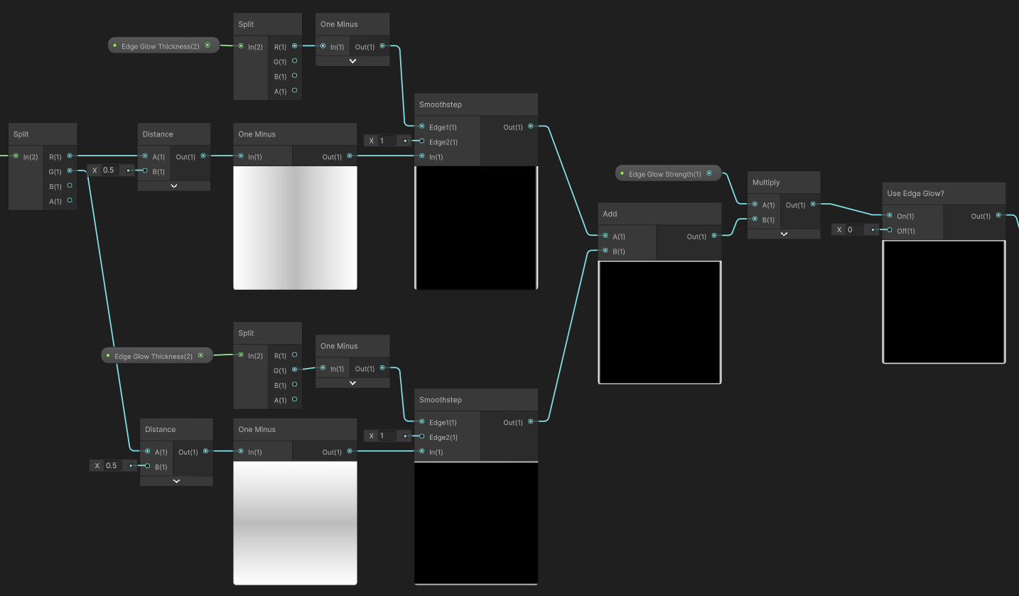
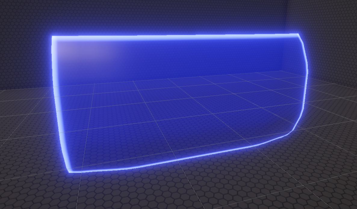
This group of nodes doesn’t do anything yet because it’s not connected to anything, but if we did connect it to the Emission output, then it would look like this:
Object Intersections
That’s just one aspect of the edge glow; we also need to handle what happens when the shield mesh clips through another (opaque) object. For that, I added two more Float properties, Intersection Strength and Intersection Thickness, similar to the properties I used for the edge glow.
To work out if a pixel on the shield is on or near an intersection, I calculate the difference between the depth of the shield pixel and the depth of whatever object has previously been rendered at that pixel. The depth of the shield pixel can be obtained using a Screen Position node in Raw mode, taking the fourth (w) component.
It’s a bit complicated to explain where this comes from, but a simplified (?) explanation is that the Raw Screen Position comes from partway through the graphics pipeline before objects are projected onto the screen. At this stage, the w component contains the distance (in Unity units) from the camera, which happens to be exactly the value we’re looking for - this representation is sometimes called ‘eye space depth’. When you divide the vector by its w component, called the perspective divide, you end up with the final screen position, normalized between 0 and 1 in the x- and y-directions, which is what Default mode gives you. But all you really need to know is that Raw w contains the eye space depth (and that RGBA in the Split node is equivalent to XYZW).
Then, I use a Scene Depth node in Eye mode to get the eye space depth of the pixel previously rendered at this position. Subtracting the previous depth from the shield depth, if this value is very small, then this is an intersection. I use a Smoothstep node to provide a falloff, but this time the values are inverted so I use a One Minus to flip them. Like I did previously, I multiply by Intersection Strength and implement the Use Intersection keyword to finish this node group.
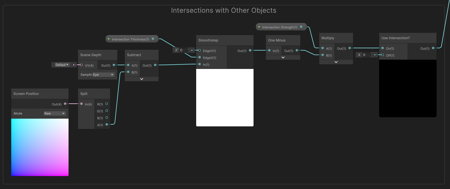
Now we will see edge glow on the shield at points where the shield intersects other objects (when we connect these nodes to the Emission output later). One caveat is that you won’t see the intersection if the camera is positioned parallel to the object being intersected.

Collision Ripples
The edges are probably glowing enough by now, so let’s handle the collision ripples. The properties are Ripple Origin, a Vector2, plus Ripple Thickness, Ripple Speed, and Ripple Time, which are all Float properties, as well as Aspect Ratio, a Float which needs to be here due to the abnormal UV setup. The Ripple Origin and Ripple Time values will be sent to this shader via scripting (not covered here, but it’s in the GitHub).
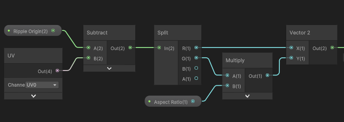
On the graph, I start by taking the distance between the current UV coordinate and the Ripple Origin, accounting for the Aspect Ratio appropriately.
I then calculate two thresholds: one for the inner part of the ripple ring, and another for the outer part. The lower threshold, which controls the position of the inner ring, increases in size over time based on the Ripple Speed. A Smoothstep node provides some falloff for the ripple; I didn’t want to introduce yet another property, so I just used Ripple Thickness for the length of the falloff. The result is a dark inner ring and the rest of the shield lights up.
For the outer ring, I add Ripple Thickness to the first threshold, and perform the thresholding with a second Smoothstep node. I One Minus the result to give me a bright outer ring, with darkness outside the ring. Multiplying these two values together gives me the ripple shape I wanted.
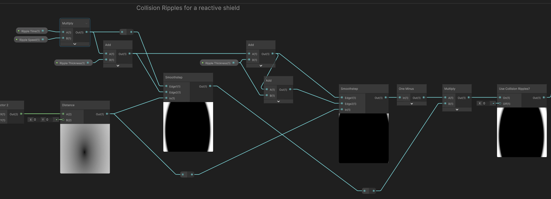
The Use Collision Ripples keyword can be toggled to turn off the ripples if we aren’t using them. Although I won’t talk about the scripting side much in this tutorial, one nice feature that I want to mention is that when you perform a raycast, the RaycastHit object contains a member called textureCoord if you’re using a Mesh Collider (no other collider type works unfortunately). This makes it super easy to work out where the ripple should originate!
Glowing Surface
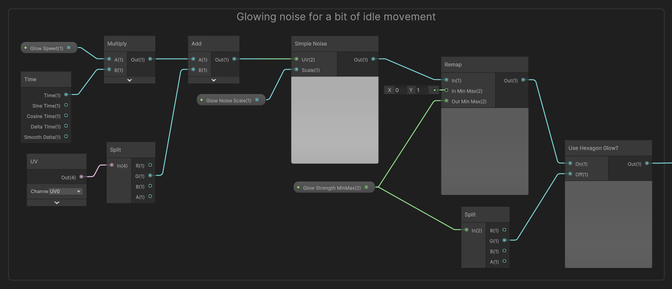
Currently, the surface of the shield is looking quite bare, so it’s time to add something here. I’ll start with a soft pulsating glow effect, which I’ll do by scrolling noise values down the shield over time. The properties are Glow Strength Min Max, a Vector2 (the x-component is the min value and the y-component is the max), Glow Noise Scale and Glow Speed which are both Float properties, plus the Use Hexagon Glow keyword (we’ll integrate the glowing with the hexagons in a later step).
On the graph, I’ll start by multiplying the Glow Speed by Time, adding the UV’s y-component, and feeding the result into a Simple Noise node using the Glow Noise Scale property. The output is a value between 0 and 1, which I’ll Remap using the Glow Strength Min Max values. In the case where Use Hexagon Glow is turned off, we’ll have to supply a basic level of glow to apply to the hexagon pattern evenly - I’ll just use the max Glow Strength value for that.
Hexagon Texture
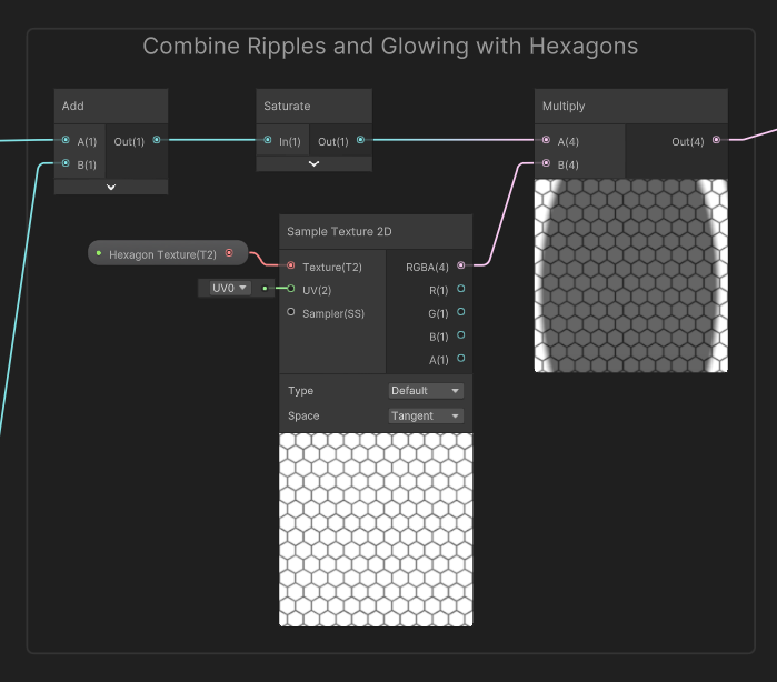
Now we’ll incorporate the hexagon pattern. I use a hexagon texture for this, although I suppose it would technically be possible to generate a hexagon pattern in the shader. I’ll leave that one as homework if you wanted a completely textureless shader! This part of the graph requires a Hexagon Texture property of type Texture2D.
Start by adding the output of the surface glow nodes we just created to the output of the collision ripple nodes. We want both of those parts of the effect to go totally dark in the spaces between the hexagons. Clamp the value so that it is between 0 and 1 by using a Saturate node, then sample the Hexagon Texture and multiply the texture and the Saturate. On the preview window, you’ll see that none of the bits between the hexagons are glowing any more.
Hexagon Heightmap
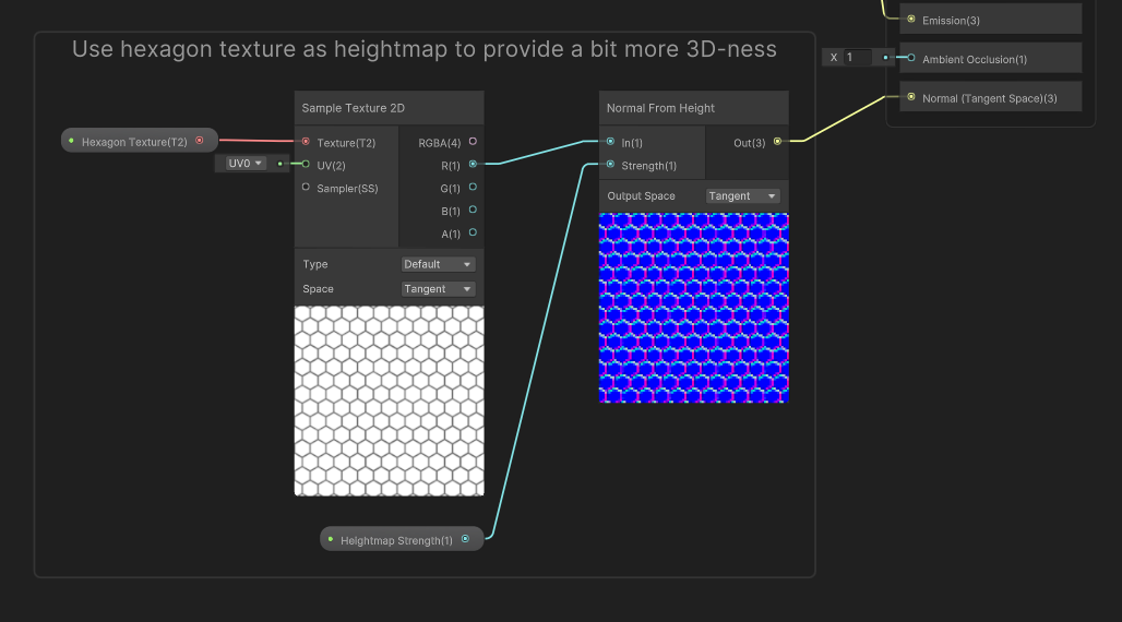
Now that we’ve finally added those delicious hexagons, it’s time to make them look a tiny bit 3D. For that, add another property called Heightmap Strength, which is a Float. At the very end of the graph, sample the Hexagon Texture once more and output the result into a Normal From Height node using Heightmap Strength in its Strength field. This node takes the greyscale values of the hexagon texture and produces a normal map that simulates those hexagons protruding from the surface slightly. Accordingly, let’s output the normals into the Normal (Tangent Space) block on the output stack.
Big Scanline
Now all that’s left to add are the scanlines. We’ll deal with the singular large scanline first. I’ll use properties called Big Scanline Strength, Big Scanline Speed, and Big Scanline Thickness, plus the Use Big Scanline keyword. Start by multiplying Time by Big Scanline Speed, then Modulo the result by 1. This gives us a clock that ticks up to 1 then wraps back round to 0, but we want it to work in the opposite direction, so One Minus the result (I didn’t just make the speed negative because values below 0 break the Modulo node).

These values range from 0 to 1, which is fine, but I’ll introduce a small undershoot and overshoot because otherwise, the bottom edge of the scanline would graze the bottom edge of the shield then pop back to the top- of the shield, which doesn’t look smooth; it’s far better to travel off the end of the shield before returning to the top. With that in mind, I Remap the values from (minus Big Scanline Thickness) to (1 plus Big Scanline Thickness), guaranteeing we’ll never see any sudden jumping. We can then take the distance between this value and the y-component of the UVs.
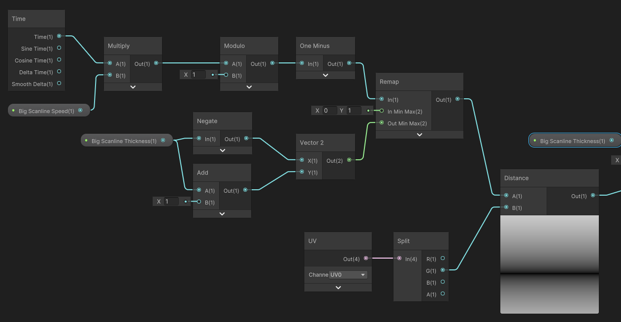
Then, I can use our familiar friend, the Smoothstep node, to create a single scanline with smooth edges; I’ll need to One Minus the result again, because the values are inverted from what we want. To wrap things up, multiply by Big Scanline Strength and incorporate the Use Big Scanlines in the same way we’ve been doing throughout.

Smaller Scanlines
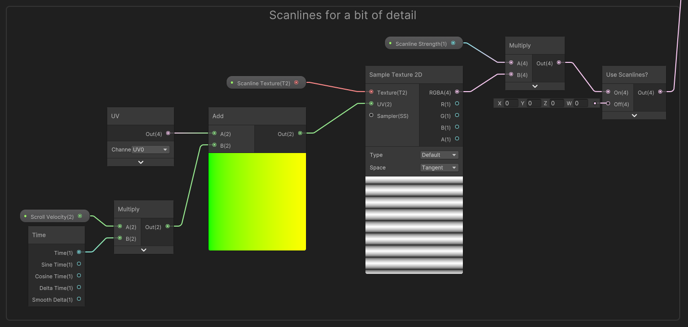
That just leaves the smaller scanlines! These ones are relatively straightforward. I’ll add four new properties: the Scanline Strength, Scanline Texture, and Scanline Velocity values, plus a Use Scanlines keyword.
Multiply the Scanline Velocity by Time and add the result to the UVs, then use those UVs to sample the Scanline Texture. Round off this group of nodes by multiplying by Scanline Strength and incorporating the Use Scanlines keyword.
Putting Everything Together
Currently, we have a bunch of disjointed node groups, and an unused Emissive Color property, so it’s time to tie everything together. Thankfully, this is mostly a series of simple additions. Take the edge glow nodes, the hexagon pattern nodes, the small scanline nodes, the object intersection nodes, and the big scanline nodes and add them all together using four Add nodes, then multiply by Emissive Color and output the result to the graph’s Emission output block. If everything was connected properly, then congratulations - you should be seeing every component of the shader working together on any object using the shader!

Here’s a reminder of what that should look like:

If you’re looking for more shield shaders, here’s one I spotted on the Unity Asset Store:
Acknowledgements
Special thanks to my Patreon backers for December 2022 - February 2023!
kai Jack Dixon JP Lee Morrie Mr.FoxQC Phillip Baxley Underwater SUN FonzoUA Josh Swanson Moishi Rand Alexis Lessard Brocktoon Hann Harshad Heikki V JP Mikel Bulnes Ming Lei mooli Muhammad Azman nicolo Olly J Paul Froggatt Will Poillion Zachary Alstadt 源 刘